Once a month we invite our International Magazine Centre members, magazine publishers and enthusiasts to guest-edit our fortnightly email newsletter. The aim is to inspire others with magazine-related content, connect Members and build our community so we can learn from each other.
This month our guest editor is Eric Campbell, the Managing and Creative Director of White Light Media, a publishing and content marketing agency based in Edinburgh. You can follow Eric on LinkedIn and Twitter – remember to connect and say hello!

Tell us about yourself
I’ve been a magazine fanatic since my early editorial designer days at The Scotsman newspaper and have led the creative direction of numerous titles since then, winning design and publishing awards on the way.
I’m a champion of creativity and lead the team at White Light Media as they work with their clients on strengthening their own comms strategies.
Don’t get me started on fonts. There’s not enough time in the day.
What are you up to at the moment?
I’m juggling deadlines with clients looking to get their projects finished before Christmas and setting up the new ones to kick-off in the new year.
We have our work Christmas lunch next week so I can’t wait to spend a bit of relaxed time with the White Light team. We’ll have a nice bite to eat with a few drinks – it always leads to some new ‘creative ideas’ for the coming year.

What’s the best article you’ve
read this month?
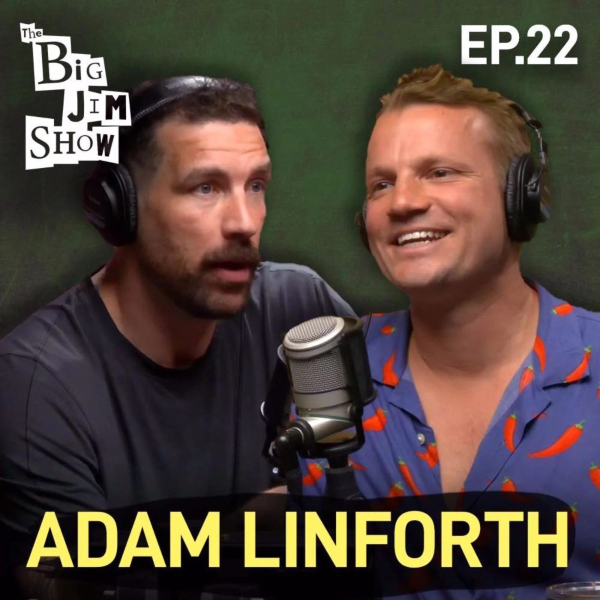
I’ve found a lot of my reading replaced by podcasts as I drive to and from work. Recently I listened to Jim Hamilton interview Adam Linforth from ‘alternative swimwear’ company Budgy Smuggler.
His story was a fascinating tale about building a business off a brand that people hated, how he jumped into a different market and discovered huge success with massive influencer buy-in, and how it led to achieving an order from the Royal Family!
It got me about thinking about approaching things differently, but more importantly, the value of collaboration and brand awareness in the right places.

Show us an incredible magazine cover
I’d like to choose two if you’ll humour me? Both from The New York Times:
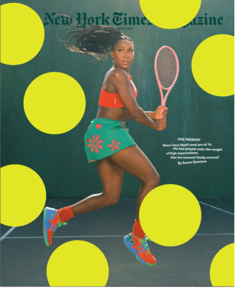
1. NYT Magazine – Coco Gauff from August 2022
Why? It’s an amazing shot of her mid backswing, jumping in the air. The light is perfect, the composition is superb, the colours of her kit and racket pop out of the darker background and the sense of movement is perfect.
When you have an image this good, as a designer the likelihood is that you’ll use it as it is. However the creative team at the NYT have added the acid green tennis ball-esque circles on top, obscuring a good chunk of the image and overlapping the masthead.
The (very subtle) coverlines support the design, telling the reader how she has been playing under the weight of high expectations and asking if this is Coco Gauff’s moment. My interpretation is that she’ll be battering those balls back across the net for a resounding YES!!

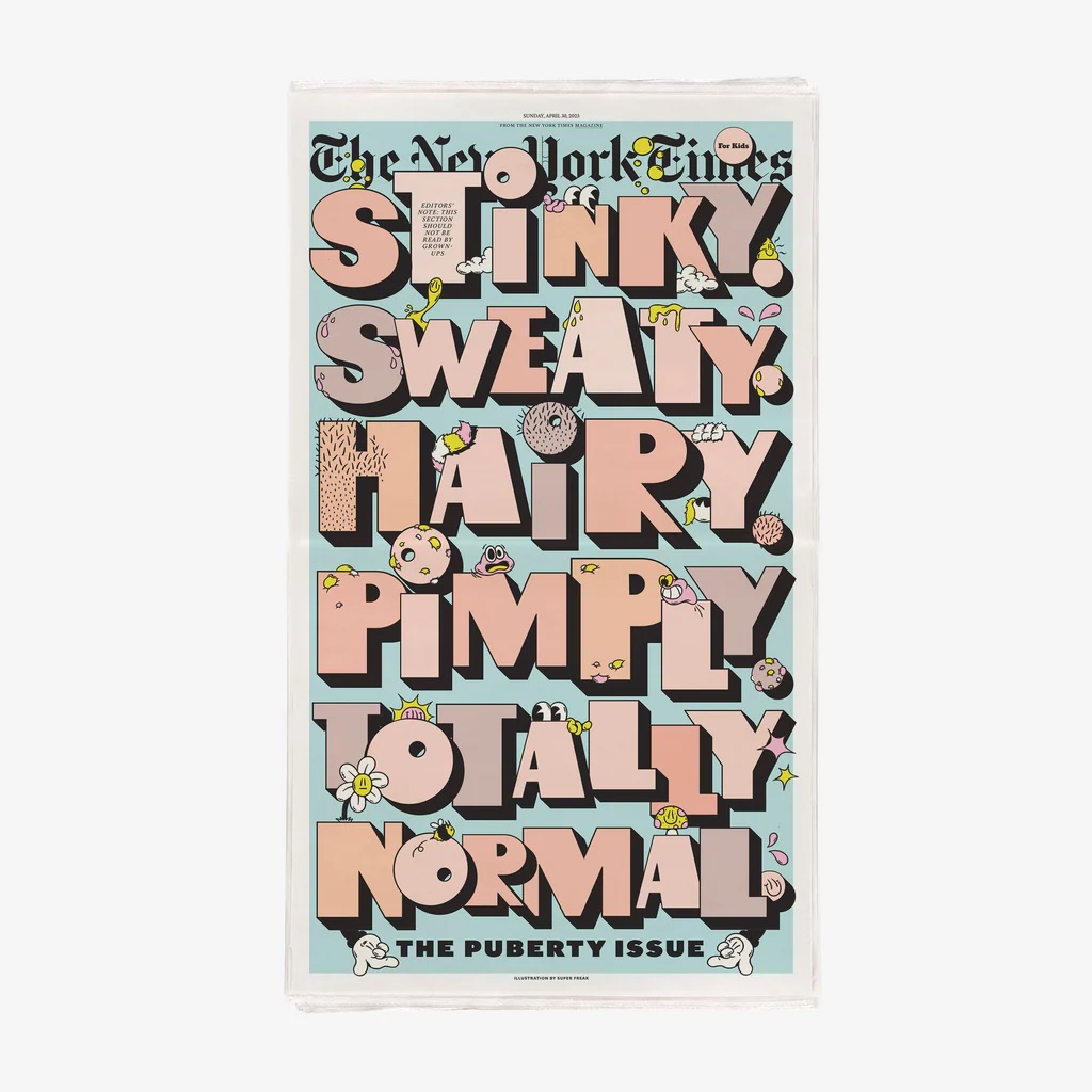
2. NYT Kids – The Puberty issue from April 2023
Why? The NYT Kids magazine covers are superb. To me they look like the creative team can have a field day with ideas to engage the target audience. The mag comes packaged as part of the paper, but what a way to make it stand out!
As soon as this gets unbundled from the main section it is bound to catch the eye of the junior members of the family.
I’m a typography nerd so as soon as I see any kind of hand-drawn bespoke illustrative type I’ll immediately pick it up. This piece of creative genius is by the team at Superfreak. Their stuff is amazing.

What’s your top tip for publishers?
Don’t be afraid to be different.
What separates us is the way we approach what we do on a day-to-day basis. If that is producing a magazine then you should be doing it your own way. Have confidence to pour everything you have into your title to differentiate it from any others competing for your audience.
At White Light we firmly believe that the basis of almost every piece of content we produce is based around people. People are interesting (even if they sometimes don’t think they have anything interesting to say) and it’s our job to entice the ‘nuggets’ out of them when we speak to them. To get those fascinating pieces of information that the audience will react emotionally to. That’s when the messaging is at its strongest.
It doesn’t matter if it’s a consumer magazine, a client CEO video, or a sales presentation – the principle is the same. When we were making Hot Rum Cow (our self-initiated drinks magazine) we had a wealth of potential content to call upon. The drinks industry is awash with amazing producers, distributers, and visionaries so we made it our mission to unearth the stories these people had to tell and bring them to a wider audience.
The way we did it was in a traditional magazine format, but the way it was presented was vastly different to anything out there at that time.
So do what you love. Inject every bit of you and your personality into the publication that you are working on because that will show. Your audience will love you for it and will come back for more.
Housty, we have a problem
What problem would you like our magazine consultant, Peter Houston, to solve in the next newsletter?
My question is: If you were given double your production budget for the next issue of Grub Street, what is the first thing you would spend it on?
Need more of this in your life?
Subscribe to our newsletters here and follow us on social on the links below.
