Once a month we invite our Patrons, magazine publishers and enthusiasts to guest-edit our fortnightly email newsletter. The aim is to inspire others with magazine-related content, connect Patrons and build our community so we can learn from each other.
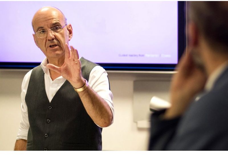
This month our guest editor is Editorial Development Director, Andy Cowles. The hawk-eyed among you will recognise Andy from his recent training session! Be sure to connect with Andy on LinkedIn and Twitter for his fantastic insights into the publishing industry.
Tell us about yourself
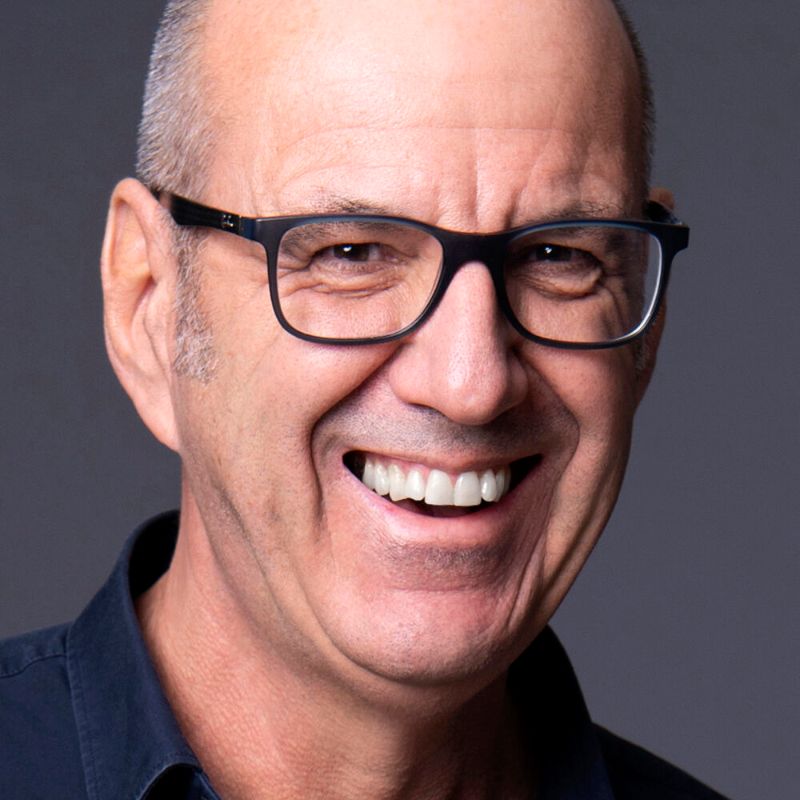
Hi, I’m Andy.
I’m the director of Cowles Media – a heavyweight design consultancy, but without the smoke, mirrors, and mad expense.
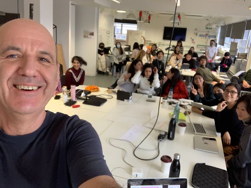
I’m also a Guardian Masterclass trainer, a lecturer on the UAL University Masters programme and the creator of bespoke training programmes for content teams everywhere. I’ve also been known to do a spot of training for the International Magazine Centre…
My leadership roles include Editorial Development Director of Time Inc. UK, Creative Director of Mademoiselle for Condé Nast and Creative Director of Rolling Stone in NYC. I was also winner of the BSME Mark Boxer Award.
What’s on your mind?
The truly appalling state of many basic B2B comms. I’m talking about unreadable white papers, illegible social posts and pitch decks that are stuffed with nonsense.
B2B comms are just the same as B2C, they are read by real people with real world problems that need fixing, They are not computers, and their business decisions are not made by committee. My wish is that businesses stopped thinking about trying to get it ‘right’ and start to think about how to make it interesting. No-one has got the time to waste on this shite anymore.
What’s the best article you’ve read this month?
Article? What, like, something longer than 100 words? You must be kidding. But seriously, I do like to read, either stuff on The Guardian, or those things called ‘books’.
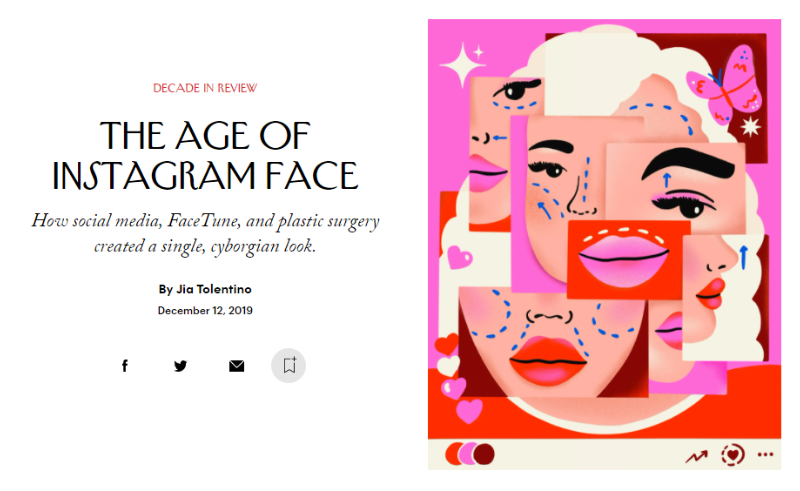
Best long-form article could well be from the August 29th issue of The New Yorker (published online in December). It’s called ‘The Age of Instagram Face’ by Jia Tolentino, and it’s all about how social media and plastic surgery created a single, cyborgian look.
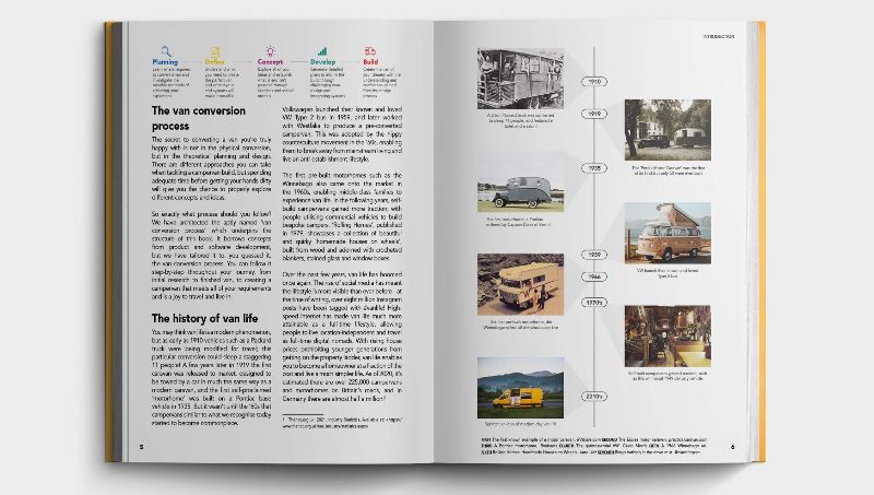
Best book is ‘The Van Conversion Bible’, which I can heartily recommend if you want something to drop off to sleep to. It’s packed full of mad wiring diagrams and detailed advice for building your own compostable toilet. I think I may just AirBnB instead…
Show us an incredible magazine cover
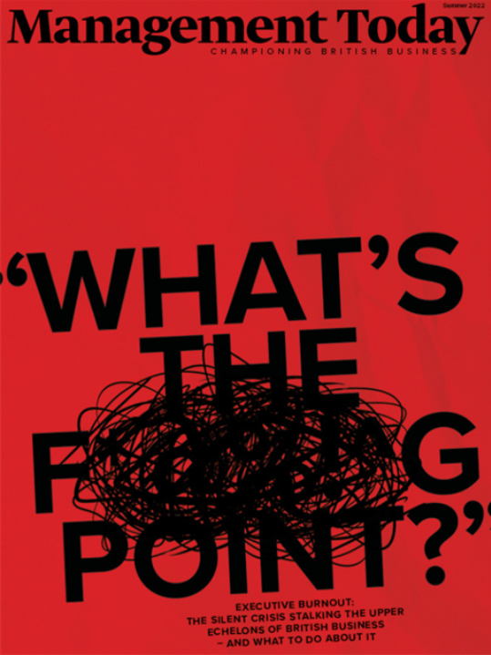
The winning BSME B2B Cover of the Year from Management Today. It’s called ‘What’s the f****ng point’. It looks like an homage to Richard Turley’s work on Bloomberg Business Week, but there’s nowt wrong with that.
What’s your top tip for publishers?
The only thing that matters now is your onboarding comms, whether that be for subscribers or clients. How you talk to people, and how you make them feel about buying into your brand has never been more important.
To this end, tone of voice is critical. B2B publishers need to understand that while they may want it to be ‘right’, their customers want it to be ‘interesting’. Working out the balance between these two extremes is tricky. Too far one way, and no-one will read it. Too far the other, and you might get fired.
But slowly iterating your way out from ‘right’ towards interesting is a waste of time. It will take forever, every step will get progressively harder, and you’ll never get far enough away from the competition to make the difference count.

Patrons receive their first 5 Ikon Images illustration uses for £50 each
My suggestion is this. Go NUTS, swing for the fences, really try to make it as interesting as you possibly can. Just don’t publish it – yet.
Then start working your way back to something that is both right and interesting. Now, every step will take you further and further back into comfort. So it won’t hurt, you’ll travel faster, and end up in a much better place.
Lastly, make sure the text font size is big enough for anyone over the age of ten to actually read. I can’t believe how many publishers fail to grasp this basic point. If you want reference, look no further than The New Yorker. On mobile it beats The New Statesman hands down, along with all the self-styled news weeklies. On paper (and I have measured this) it’s set in Garamond 10/12.
That’s proper order.
Housty, we have a problem
What problem would you like our magazine consultant, Peter Houston, to solve in the next newsletter?
My question is: How do you feel about publishers using Dall-E AI technology to create original imagery for social content? Will this post-truth facility require some kind of taxonomy, in the same way we label ‘branded content’?
Need more of this in your life?
Subscribe to our newsletters here and follow us on social on the links below.